Posted by Rik Leja | Wednesday, 11 July, 2018 | No Comments
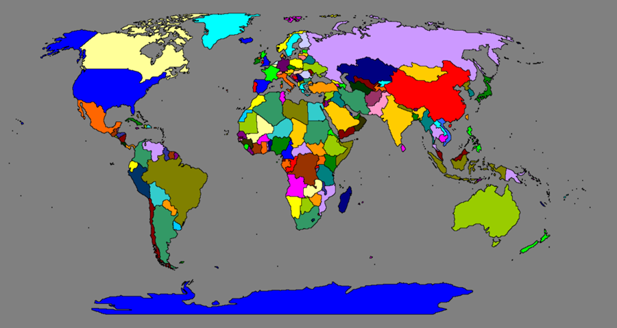
For this project I decided to create an interactive world map in Excel treating each cell as a pixel and carving out the natural and political borders of territories, countries, and islands using colors and cell borders to differentiate the areas. My finished map looks like this:
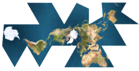
A few notes on maps before we dive in. There are, unsurprisingly, a variety of ways to attempt to portray our three-dimensional, spherical world, on a two-dimensional surface. There are specific reasons for creating a map one way or another, and the most famous in history is arguably the Mercator Projection. That one is useful for navigation purposes but heavily distorts land masses, especially near the poles. If you are looking at a map and notice that Greenland appears larger than all of Africa, you are likely viewing a Mercator Projection. The map I used is known as the Robinson Projection. Though not entirely accurate, the Robinson is seen as a good compromise between various projection styles. There is minimal distortion of areas around the poles, unlike the Mercator Projection, and it was created with aesthetics in mind. The Robinson Projection is seen as a good all-around representation of our planet. There are other, more, shall we say, uninhibited variations…
(Seriously, what are you doing?)
…but the Robinson is used by the good people at Rand McNally so let’s stick with that.
It should go without saying that this map is an approximation at best (and if you think about, all maps are approximations, if they weren’t they would cease to be a map and become the very thing the map was trying to map) and many of the island’s sizes are grossly overstated. Still, it is nice to be able to see their approximate locations even when completely zoomed out. And the islands have some stories as well. Whether they are considered the most isolated island on Earth or inhabited by maniacal, lighthouse-dwelling tyrants, even the most remote parts of our planet seem to have a story to tell.
A quick disclaimer, there are quite a few areas of the world that are claimed by multiple people or governments. This puts the cartographer in a delicate position because it essentially allows them to choose sides by directly stating whom a disputed area belongs to. The most common way of remaining neutral in these disputes is to list the areas as either disputed or list them separately, I have chosen to list them separately, for the most part. So, for instance, the Falkland Islands (claimed by both the U.K. and Argentina) on my map are listed as “The Falkland Islands,” very simple. In addition, some areas that are uncontested but are simply far geographically from the main body that clams them are also listed separately, these would include Bouvet Island (a territory of Norway), Caribbean Islands under the Netherlands, islands under the U.K. etc. Speaking of the U.K., that is also broken up here into its components of England, Wales, Scotland, and Northern Ireland because they are considered distinct enough destinations to be checked off by travelers, though, for other reasons, no US state is listed separately. A similar situation stands for Hong Kong and other areas/islands in relation to China as well as America and Puerto Rico. Names, too, are not without controversy. Often I have looked to both the U.N listings as well as major publications with more wherewithal than myself to decide on a name, Myanmar, for example, is listed as Myanmar and not Burma because that is the official name listed at the U.N. and therefore recognized as such by such publications as “The Economist.” Depending on how far down the rabbit hole you want to look, there are even more, albeit minor, divisions that can be claimed now or have been claimed in the past, and the Conch Republic of Florida comes to mind as well as this man who claimed he didn’t have to pay taxes to the Australian Government because his farm was, he claimed, his independent and sovereign property. In short, the world of the various borders of, well, the world, is a messy place and I did my best to represent the entirety of global political disputes and unique areas at present within my map contained on a sheet in an Excel workbook. (An interesting aside, as I was creating this Swaziland officially changed it’s name to eSwantini so I had to go back and modify it.)
Now, armed with a little more knowledge about the world and maps, and having selected the preferred map type, we can begin crafting our own version. Time to open Excel.

Making the map
This section will cover how the map was created and the macros used in creating it. I changed the cells to be 10 pixels by 10 pixels, small enough to allow plenty of detail and large enough to be manageable. Next, I placed a background image in the spreadsheet of a world political map. If you haven’t used a background image before you can easily add one by going to the Page layout tab -> Background and a window should pop up allowing you to navigate to the folder you have the image saved to.
A background image will sit behind the cells and can be easily painted over. From this point it is simply a matter of carving out each country by following the border lines on the map and inserting the names of each area into the appropriate cells. It was a bit time consuming but there are a few shortcuts to speed along the process.
Step 1: Quick Entry System
The easiest way to carve out a country is to first draw the borders then simply fill in the area between. The slow way is to move the cell selector along the borders and manually enter the country’s name into each cell. The quicker way is to have Excel enter a “1” every time the cell selector moves into a new cell (changing the 1’s to the country’s name later, of course). First, you need to have it run each time the active cell changes. From there it is simply a matter of changing the value in the new active cell to whatever you want. However, I wanted a quick way of turning this ability on and off so that I could move around and adjust borders without always entering something into the cells automatically. I set up my auto-enterer to only run if cell A1 had a 1 in it, that was my idea of a quick and dirty on/off switch so here is that first:
sub onoff
flip = range(“A1”).value
if flip = 1 then range(“A1”).value = “”
else
range(“A1”).value = 1
end if
end sub
Obtain the value in A1 and store that value in variable “flip,” if flip is already a 1 then change the value in A1 to nothing. If flip is already equal to nothing then enter a 1 in the cell. In the macro options I enabled this macro to run whenever I pressed ctrl + w. Now I can carve out a border effortlessly and when I need to backtrack or move the cursor to get a different perspective I just press the shortcut keys and I am free to move without spewing data all over the place. Speaking of spewing data, here is the auto-entry macro:
Sub Worksheet_SelectionChange(ByVal clicked_cell As Range)
If Range(“A1”).Value <> 1 Then Exit Sub
If Selection.Count = 1 Then
clicked_cell.Value = 1
End If
End Sub
Instead of putting that macro in a module I put it only on the sheets that I wanted it to run on and you can see that in the VBA editor if you open the project. Every time there is a selection change on the desired sheets this macro will run. If A1 is not equal to 1 then the routine will quit. If there is a 1 in A1 then the macro checks to see if the selection is a single cell of a range, if it is a range it will also quit. If it is a single cell then it will automatically enter a 1 in that cell (overriding anything else that may have been in there so be careful).
So now, whenever you move over an area, all the cells in that area will hold the desired value, in this case 1. This allows for rapid entry but should be handled with care.
Once a single area is completed it will basically be a blob of 1’s, this macro will find all the 1’s on the map and convert them to the name of the country you were building, in this example I changed them to Antarctica:
Sub findernum()
r = 1
c = 1
Do Until r = 679
If Cells(r, c).Value = 1 Then
Cells(r, c).Value = “Antarctica”
c = c + 1
Else:
c = c + 1
If c = 1292 Then
c = 1
r = r + 1
End If
End If
Loop
End Sub
Step 2: Painting in the Cells.
After filling in a region with a few countries it would be nice to paint them and see how the map is coming along. “name1” will be the variable that holds the country’s name as we move from cell to cell, start by making name1 = “”. Check each cell in the map area, if they are empty then move to the next cell, if they hold a value then compare that value to the value stored in name1. If they are different then have name1 store the current cell’s value and perform a vlookup to obtain the color index value from the “Data” sheet.
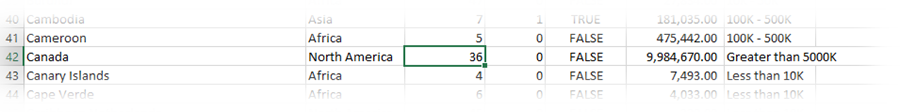
For example, the vlookup for Canada will return 36
Set the variable “paint” equal to that value then paint the cell that color as well as it’s text so that nothing sticks out. The reason I compare the new cell’s value to the previous is to limit the amount of vlookups, for instance, Russia is really long. When the macro paints a Russian cell purple then finds another Russian cell to the right there is no need to re-lookup what color Russia is, I just have it use the same value for paint. This saves a bit of time. Another quick optimization tip is to always turn off screen updating when formatting large amounts of data, this stops Excel from re-drawing the screen every time. When turning off screen updating remember to turn it back on just before exiting the macro. Anyway, here is that macro:
Sub colorbyname()
Application.ScreenUpdating = False
name1 = “”
paint = 2
r = 1
c = 1
Do Until r > 679
If Cells(r, c).Value <> “” Then
If name1 <> Cells(r, c).Value Then
name1 = Cells(r, c).Value
paint = WorksheetFunction.VLookup(name1, Sheets(“Data”).Range_
(“A1:D263”), 3, False)
End If
Cells(r, c).Interior.ColorIndex = paint
Cells(r, c).Font.ColorIndex = paint
End If
c = c + 1
If c = 1292 Then
c = 1
r = r + 1
End If
Loop
Application.ScreenUpdating = True
End Sub
So, once I had finished entering in a country I could run that macro and see how it looked when colored in. Next, I wanted to give each country a border.
Step 3: Creating Borders
This macro I have recycled from an earlier blog about growing plants in Excel (it’s not as weird as it sounds). Since each area has it’s own unique value all that needed to be done was to compare a cell to it’s neighbors. If they held different values then place a border between them. Only two borders are necessary because a right border on one cell if the same as a left border on the other, ditto for top and bottom. If the cell above is not equal to the current cell then draw a top border on the current cell. There are two (and could probably be combined into one for efficiency but I never really had the need to) and they have a similar set up to the painting macro as far as looping through cells is concerned:
Sub findbord()
r = 2
c = 1
Do Until r = 679
If Cells(r, c).Offset(-1, 0).Value <> Cells(r, c).Value Then
Cells(r, c).Borders(xlEdgeTop).LineStyle = xlContinuous
c = c + 1
Else:
c = c + 1
If c > 1292 Then
c = 1
r = r + 1
End If
End If
Loop
Call findbordr
End Sub
Sub findbordr()
r = 2
c = 1
Do Until r = 679
If Cells(r, c).Offset(0, 1).Value <> Cells(r, c).Value Then
Cells(r, c).Borders(xlEdgeRight).LineStyle = xlContinuous
c = c + 1
Else:
c = c + 1
If c > 1292 Then
c = 1
r = r + 1
End If
End If
Loop
End Sub
After completing all of the above steps for the entire world there was one obvious annoyance, the cells are so thin that the names along the East coasts, or any territory that had a blank cell to it’s right, would have it’s name overflow over it’s neighbors’ cell. To fix this, simply put a blank space, one of these ” “, into each empty cell. You can easily modify one of the macros used previously to enter a ” ” into every cell whose value is “”.
If Cells(r, c).Value = “” Then
Cells(r, c).Value = ” “
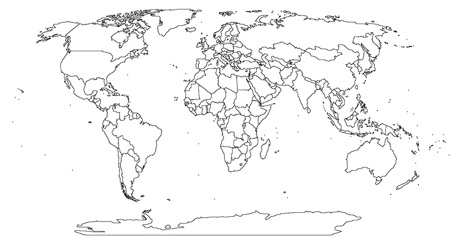
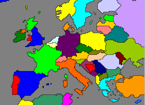
What is left is a fully polished and complete world political map. Below you can see the borders only version. The next part deals with a couple equations, graphs, and adding the interactivity.
Linking the Data
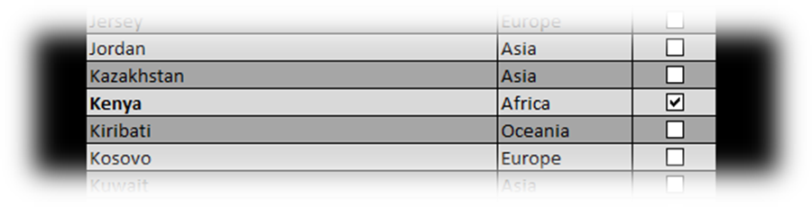
The data is already living happily in the Data sheet but we have to still link the check boxes to the appropriate cells. Create a new sheet, I called mine “Check List,” and copy the region names as well as the corresponding continent column, paste them into Check List. The first region name should be in cell B2, the continent will be listed in cell C2 so insert a checkbox into cell D2. To insert one, click on the developer tab, go to insert and under form controls you will see a check box. Click on it and draw it on the sheet, you can position it once it has been drawn on the sheet, make sure it is in the exact position you want because it will be copied down some two hundred sixty-two times. It should also reside entirely within the cell. Once you have it in place, drag the cell down so that it is copied into the cells below, populating each row with a checkbox.
The default name for the first check box should be “check box 1” and each successive box should be called “check box 2,” “check box 3,” etc. So, in the next macro we will loop through them in the following way: “check box ” & lr will be linked to sheet “Data” cells(lr + 1,5) with lr being the row variable and we simply add 1 to lr after each loop. The check boxes will also have a caption next to them which I think looked pretty ugly, the macro also removes this as it moves through the boxes.
Sub links()
lr = 1
Do Until lr = 263
ActiveSheet.CheckBoxes(“Check Box ” & lr).LinkedCell = “Data!$E$” & lr + 1
ActiveSheet.CheckBoxes(“Check Box ” & lr).Caption = “”
lr = lr + 1
Loop
End Sub
After running that macro test it to make sure things worked. Check any box and the corresponding row in the Data sheet should have “TRUE” in it. Uncheck the box and the same cell should have “FALSE.”
The true/false information is stored in column 5, to make calculations a little easier I wanted to use a 1 or 0 to represent true of false respectively. In column 4 simply use
=if(E2=”TRUE”,1,0)
and if the E2 is “FALSE” then D2 will have a 0, if E2 is “TRUE” D2 will be 1. Copy this equation down to row 263. I will use those 1’s in column 4 later. There is one more thing I want done before leaving the Check List sheet, I want every cell in column B to be conditionally formatted so that if I check a box in column D the region name in column B turns bold, this makes it just a little easier to see if I checked the correct box.
This macro will apply the conditional formatting to all the cells in column B from 2 to 263:
Sub boldinator()
r = 2
Do Until r = 264
Cells(r, 2).FormatConditions.Add Type:=xlExpression, Formula1:=_
“=VLOOKUP(B” & r & “,Data!$A$2:$D$263,4,TRUE)=1”
With Cells(r, 2).FormatConditions(1).Font
.Bold = True
End With
Cells(r, 2).FormatConditions(1).StopIfTrue = False
r = r + 1
Loop
End Sub
All that is happening up there is the macro runs through each cell from B2 to B263 and it applies the conditional formatting equation. If you are wondering why I used a vlookup instead of simply pointing Check Lists’s B2 to Data’s B2 it’s because, since I have optioned to allow the check boxes to move and size with cells the check boxes actually follow the cells if the users re-sorts the Check List regions or continents. So the cells may not always match up, hence the vlookup. And what that vlookup does is very simple, if the value of my cell is found in column A in the Data sheet then check column 4 of that same row. If column 4 has a 1 then make my cell’s font bold.
My World Map
The colorbyname macro will only need to be modified slightly. In the Check List tab, run through the list and check any boxes you like, this will result in a 1 in that country’s row in the Data sheet, signifying that you desire it be colored in on the map. Now, when the colobyname macro is running and it discovers a cell that needs painting, have it first investigate whether or not the user desires it to be painted by performing a vlookup for that cell’s value only this time, instead of grabbing the colorindex, grab the binary 1 or 0. If it is a 0 then skip the vlookup but set “paint” = 2 so that the cell is painted white, if it is a 1 then run as normal. You can see the addition of that logic below:
Sub colorbyname()
name1 = “”
Application.ScreenUpdating = False
Sheets(“My World Map”).Activate
paint = 2
r = 1
c = 1
Do Until r > 679
If Cells(r, c).Value <> ” ” Then
If name1 <> Cells(r, c).Value Then
name1 = Cells(r, c).Value
number2 = WorksheetFunction.VLookup(name1, Sheets(“Data”).Range_
(“A1:D275”), 4, False)
If number2 = 1 Then
paint = WorksheetFunction.VLookup(name1, Sheets(“Data”).Range_
(“A1:D275”), 3, False)
Else
paint = 2
End If
End If
Cells(r, c).Interior.ColorIndex = paint
Cells(r, c).Font.ColorIndex = paint
End If
c = c + 1
If c = 1292 Then
c = 1
r = r + 1
End If
Loop
Application.ScreenUpdating = True
End Sub
Take it for a test run! Check off some boxes (places you have personally visited or whatever you like!) and then click the button “Color My Map.” A word of caution, this is a big sheet with lots of data, on my desktop the macro runs in about 25 seconds or less. On my much older laptop it can take a couple minutes. Some patience may be required on an old machine but the patience is rewarded with a beautiful and personalized map:
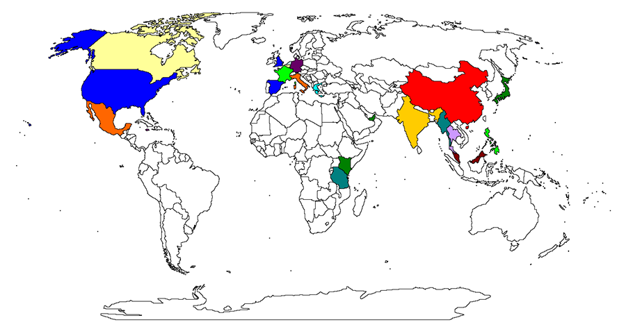
I’ve still got a lot to see!
A few tips to help you navigate these maps. In Excel Ctrl + Shift + F1 will toggle between fullscreen but it doesn’t seem to remove the formula bar as well. You can remove the bar in Excel options but I also wrote a quick macro that toggles it how I like.
Sub fs()
If Application.DisplayFullScreen = False Then
Application.DisplayFullScreen = True
Else
Application.DisplayFullScreen = False
End If
End Sub
I set that to run on keyboard shortcut Ctrl + w and it’s now easy to enter and exit full-screen. You can zoom in and out by holding Ctrl and using the scroll wheel on the mouse. That helps you zoom in and out if in full-screen.
A little bit more Interactivity
Another thing I wanted to accomplish with my map was to allow the user to click on any country and make some way of telling them which country they clicked on. Initially the formula bar would do the trick but there were two problems: one was that I prefer to view the map in full screen with no formula bar, and second, If the user clicks in a dense cluster of different areas it may be difficult to distinguish where exactly they clicked. I decided to create a macro that automatically puts in a comment on the clicked cell and displays the name in the same color as it appears on the map. So, it would look like this:
And to achieve that I modified the macro that runs on selection change. Here are the first if statements plus an error catcher:
Sub Worksheet_SelectionChange(ByVal clicked_cell As Range)
On Error GoTo bye_bye:
Call delinote
If Selection.Count = 1 Then
If ActiveCell.Value = ” ” Then
Exit Sub
End If
The first thing that macro does is check for any errors, maybe you clicked way beyond the borders of the map somehow or something, I don’t know. All that makes the macro do is jump to the error handler called “bye_bye” at the bottom of the routine which exits the routine entirely. Next, it will clear the map of any comments so they don’t clutter up the joint as you click around and explore the map), this is achieved by calling a sub routine called “delinote.” Next, it checks to see whether the selection made is a single cell or a range, if it is a range then it does nothing. If it is a single cell it then checks to see whether it is blank or not. If you click a “blank” cell, the cells I use all have spaces if you recall but I’ll refer to them as blanks, it will exit the routine.
If Intersect(clicked_cell, Range(“A1:AWQ679″)) <> ” ” Then
Call note
End If
End If
bye_bye:
Exit Sub
End Sub
If it passes all the if statements then, before exiting, it calls something called “note.” Here is what note is and what it does and how it does it.
“note” will insert a comment into the current active cell. It will alter the font based on the current zoom level of the map so that the comment’s text looks (approximatley) the same size (though I allow the text to appear larger as the zoom gets very large) no matter what the zoom level. The comments background will be black and the text’s color will match that of the underlying territory selected. Basically, just see the above gif.
First set all the variables:
Sub note()
Z = Round(ActiveWindow.Zoom / 10) * 10
fsize = WorksheetFunction.VLookup(Z, Sheets(“Data”).Range(“P2:Q41”), 2, False)
cc = ActiveCell.Interior.ColorIndex
Z will get the windows current zoom and round it to the nearest 10. “fsize” is a vlookup again, I have a table in the Data sheet that lists the desired font size based on zoom level. So if Z is 10 then it will look up the value at 10 which is 90. Font size will be set to 90. On the other end of the spectrum, if Z is 400 then font size will be 3. “cc” picks up the color of the selected cell.
With ActiveCell:
.AddComment
.Comment.Visible = True
.Comment.Text Text:=ActiveCell.Value
.Comment.Shape.TextFrame.Characters.Font.Size = fsize
.Comment.Shape.TextFrame.Characters.Font.ColorIndex = cc
.Comment.Shape.TextFrame.AutoSize = True
.Comment.Shape.Fill.ForeColor.RGB = RGB(0, 0, 0)
End With
End Sub
The width block sets the comment visible, sets the text equal to the value of the cell (so if you click on a Bulgarian cell the comment’s text will read “Bulgaria”), sets the comment’s font size equal to fsize, sets the text color equal to cc, sets the comment’s width to auto fit, and sets the background color to black. Phew…
Data Summary
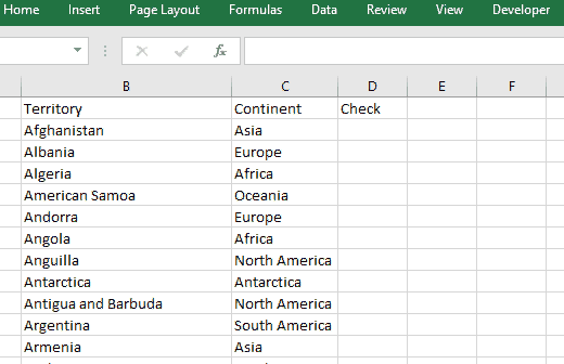
The data for this project is lifted from Wikipedia (which in turn was taken from various sources including the CIA World Fact-book and others). It is organized alphabetically by region name. It includes each region’s size in square kilometers though there is always debate about what to include where and why. I also have countries organized by continent and there are a few that span more than one. I simply placed them on whatever continent the majority of the country lies on. Egypt, for example, is considered part of Africa despite a chunk of it technically being in Asia. So none of these should be considered exact but they are fun to play around with. In this final section I wanted to just use some sumif and countif equations and make a few graphs.
The data is organized here in the Data sheet:
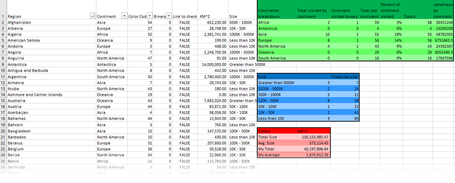
The values in columns 1, 2, 3, and 6 are hard-coded in. Column 4 has already been covered above and 5 is simply the linked cells, also covered above.
Column 7 has a pretty big nested ifs equation that categorizes each country by size into six different size brackets. You can copy and paste this equation or take it from the workbook itself (embedded at the bottom) but it’s always fun to try to write one of these in one go and not get an error message at the end.
=IF(F2>5000000,”Greater than 5000K”,IF(AND(5000000>F2,F2>1000000),”1000K – 5000K”,IF(AND(1000000>F2,F2>500000),”500K – 1000K”,IF(AND(500000>F2,F2>100000),”100K – 500K”,IF(AND(100000>F2,F2>50000),”50K – 100K”,IF(AND(50000>F2,F2>10000),”10K – 50K”,”Less than 10K”))))))
You can use a sumif to get all the countries you have check off and break them down by continent. A sumif is very useful for summing only numbers that fall into a certain category. This is where my binary number column comes in especially handy because I can just sum all the ones corresponding to a certain continent and I will end up with the total number of places visited in that continent only. This can be done for all continents and then a nifty graph can be created from the data. So, very briefly, this is how sumif works:
SUMIF(Column holding categories, Category I want summed, Column holding the numbers to be summed)
So mine looks like this, keeping in mind that the continent names are listed in column H. Instead of the cell reference H2 I could have easily just put “Europe” or “Asia” etc. and the sumif would return the number of places I have checked off from each of those continents.
=SUMIF(�2:�263,H2,�2:�263)
Next is the mighty countif.
COUNTIF(Column holding categories, Category I want counted)
So mine is:
=COUNTIF(�2:�263,H2)
Instead of summing this one simply counts, so if I want the total number of territories in Asia, I just count all the rows that have Asia in them. I also used that data to make a graph.
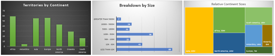
There are a few sheets that have graphs. My Graphs has the breakdown of all the checked areas and Graphs is a total breakdown of the data for the entire world, organized by continents. I’ve also got an enormous pie chart and a completely unnecessary but cool none-the-less graph of relative sizes by country. Feel free to play with the data and create any type of graphs you like! There is a lot more that can be done with this data but I will end here with those few examples.
My Graphs
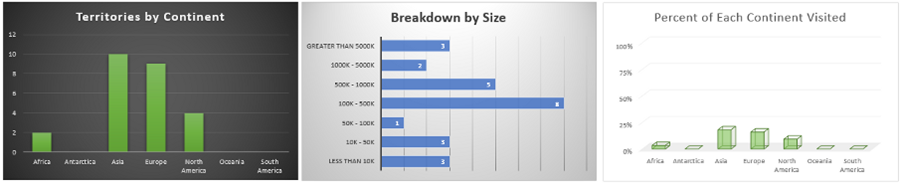
Graphs of Totals
The Check List sheet provides a summary of the places checked off.
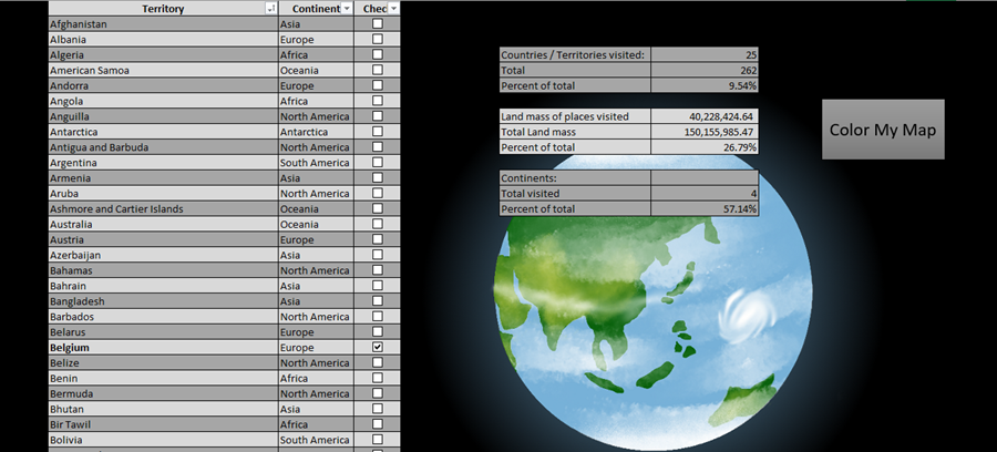
Total places is obtained by counting all the values in Data’s column A minus 1 (for the header). Total places visited is obtained by taking the sum of Data’s column 4 (the binary variables 1 or 0 depending on whether the corresponding box has been ticked). And percent is simply visited over total. To obtain the number of continents visited was pretty easy too. For every place visited, check off it’s parent continent. I also used a if statement to return a binary 1 or 0, on the Data sheet if the sumif equation for each continent was greater than 0 then it returns a 1. Summing that column gives the total number of continents visited from 0 to 7 (I’m pretty sure you can’t have visited 0 continents but you get the idea).
Conclusion
I had a great deal of fun doing research for this project as well as making it. I hope you enjoy this interactive map and feel free to take it, change the colors around, remove the borders (it looks really cool without borders as well!) and even post your own creation in the comments or on the Facebook or Twitter pages of Leja VBA Solutions. Never stop creating and exploring!
Download the workbook below